
Mysteries of the unexplained
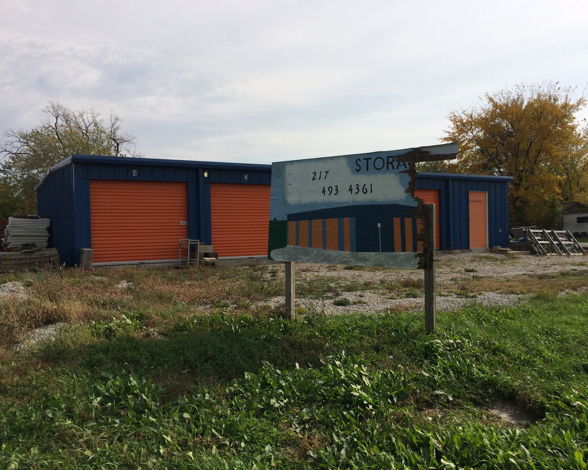
My dad and I were chasing trains in Gibson City, Illinois this past fall when I saw something out of the corner of my eye that I knew we had to drive back to and take another look at. Now that in itself is nothing unusual; my father is endlessly patient in circling the car around to check out a scene that might warrant making a picture. But I knew this wasn’t going to be a “proper” Tri-x photograph because, if I’d seen what I thought I had, it could only be in color, which meant hello iPhone. Anyway, here’s the picture:

I hardly know where to start.
I remember that day wondering if the sign was painted en plein air, already attached to its posts, a faithful view of the storage building from that angle. I had taken the picture quickly, and I had nothing more than an iPhone-sized view to go on that afternoon while out driving, so it was plausible. Mostly I just loved the thought of the painter moving every now and again from behind the plywood canvas to measure his work against the world.
But it’s likely not that romantic. The painting’s perspective of the building is from the right edge of my photograph. So it might have been made from a photograph of the building from that angle, or an architect’s rendering. The building is pre-fab, so there are probably illustrated sales materials extant. In any case, it still could have been painted out there in the yard, but I think probably not; it’s a studio work.
However it was made, the more pertinent question is Why? What was the sign meant to communicate – other than the phone number and I guess perhaps its existential nature as STORAGE – that the building itself could not? Ah, but so maybe that means that the sign predates the building. This is a promising thought, because the building does appear at least no older than the sign. Which may then indicate that indeed some sort of promotional material is the image source on which the painter relied. It could even be that there was a “Coming Soon” placard attached to the sign, the removal of which damaged the right edge of the plywood.
Say that the sign at one point aspired to present to Gibson City a happier future, one with ample storage capacity. Where citizens’ currently-unneeded possessions could reside in a structure whose color scheme honored its pride of place in Fighting Illini country. Where the skies are not cloudy all day, except for that one with the hard angles that helps you read the phone number. Which it appears the digits themselves are standard hardware store issue decals or possibly stenciled in, in a typeface incongruous from the text.
Oh hell, I don’t know. Like Russia according to Churchill, this thing is a riddle wrapped in a mystery inside an enigma. And there’d be no fun in finding its solution; all of the not inconsiderable pleasure lies in imagining the contingencies.
It’s not unlike the delight I take in what I consider the single greatest landscape photograph ever made, Stephen Shore’s “U.S. 97, South of Klamath Falls, Oregon.”1 If somehow you don’t know this picture:

Here’s what the website of the Metropolitan Museum of Art has to say about their possession:
This photograph succinctly demonstrates the post-Romantic perspective on American landscape that Shore shared with the other photographers associated with the “New Topographics” in the mid-1970s. Rather than the majestic views produced by Timothy O'Sullivan, Carleton Watkins, Edward Weston, Ansel Adams, and Minor White (who was Shore’s teacher), Shore gives us an image of nature occluded by its own representation. An ironic commentary on “authentic” natural experience, this photograph also displays Shore's impeccable color sense – which, along with that of a few other photographers in the 1970s – pulled color photography out of its exile in the commercial world and into the realm of serious art.
So there’s the textbook way to bludgeon a picture and leave it for dead. I mean, all those words are accurate, but they seem to me to miss entirely the abject wonder that I experience when I look at it. I want to pursue the Why?, for the pleasure of the question and not its answering. And to be fair to the Met, they’re not gonna go into depth to decode every single one of their millions of holdings. That’s what dudes online are for, so here goes.
First off, it’s good to know that Klamath Falls is 228 miles pretty much due south of Mt. Hood, the inactive volcano in the Cascade Range that’s pictured on the billboard. Rest assured that you can’t see that particular mountain from there. And even if you could, this wouldn’t be the face that would present. The painted image is of the view from Lost Lake, which lies some 15 miles to the north-northwest of the summit.
Mt. Hood is Oregon’s iconic natural wonder, so its likeness on a sign – on a Board of Tourism advertisement, say – would not be unusual anywhere in the state. Nonetheless, it should be noted that people in that part of Oregon wouldn’t consider Hood a first choice for recreation or tourism, as both Mt. Shasta and Mt. Bachelor are much closer and are equally alluring.
But so was this billboard used to promote tourism? The painted-over text makes manifest a tantalizing mystery. Even as to whether it was indeed words that were painted over. But it had to have been, right? Yeah, I think so, but why the alteration? Did the message somehow become inoperative or outdated enough that it had to be removed? (The values of tourism seemingly so immutable.) Did the lessee of the billboard space fail to make a payment and so the lessor obliterated the slogans lest free advertising be had? (The marketing budgets of tourism seemingly so reliable, even if not permanent.)
Whatever the reason for the overpainting, why only those rectangles? Did the owner hope that the image of Mt. Hood could meet the needs of some other client by just swapping out the advertising copy? Did he only have so much blue paint? (Of two different hues?) Or is it – and this is my preferred guess – that he thought the picture of the mountain was just too pretty to destroy if the space was otherwise unrented?
Who knows? Who’ll ever know at this point? And I think that’s lovely, and I hope we can relax and dwell contentedly in that uncertain loveliness. Or, y’know, at least store some of our stuff there.
1. I recently saw Shore in conversation with Peter Schjeldahl at Aperture. On one of the few occasions when Shore got a word in edgewise, he said something really interesting: “There’s this picture I did of a billboard with a painting of a mountain on it and it had this incredible sky and I saw it out of the rearview mirror as I’m driving and it was like ‘That’s a no-brainer’ and people say that’s a great picture and I think ‘Gee, anyone who was there and saw it would have taken it.’”
He’s being far too modest. Yeah, maybe after 1973, when the picture was made, or really more likely after 1982, when Uncommon Places was first published – then anyone would have taken the photograph. But not before. Probably Walker Evans would have known what to do with it, but it sure wouldn’t have been the same in black and white.